Project themes
Name the colours a design is drawn in, and a second theme restyles the whole project in one click.
A colour on a widget is normally a hex value stored on that widget, so changing an accent colour means finding every place that uses it. A project theme replaces the value with a name. You give a colour a name once, widgets point at the name, and a theme says what colour each name is. Add a second theme and the same design has a second look.
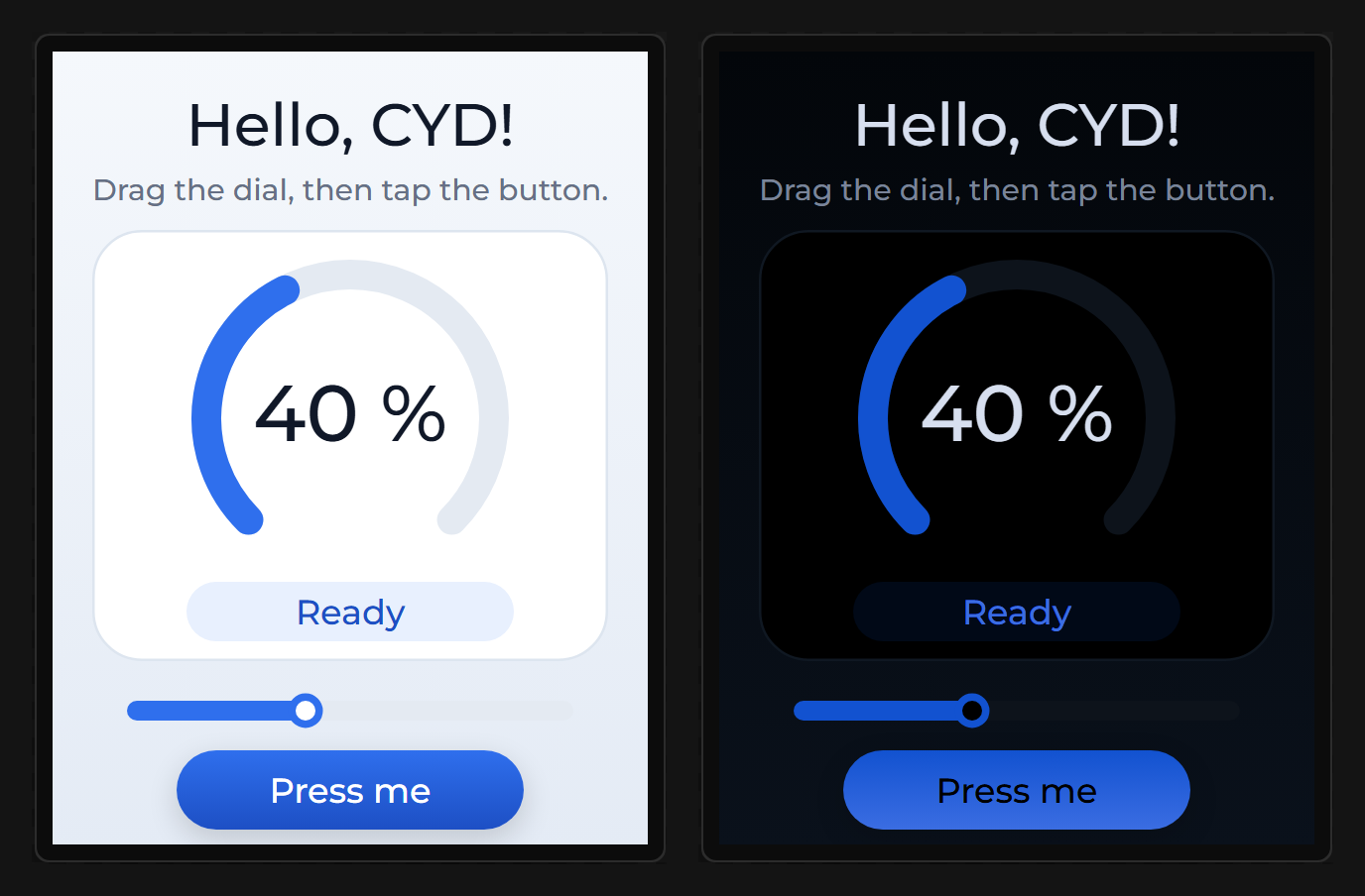
Project themes are part of Pro. Making a named colour or a theme needs Pro. A design that already has them opens, edits, exports, publishes and clones on any plan, and with no account at all. See Accounts and limits.
Named colours
A named colour has a name and one value in each theme. These places can hold a named colour instead of a plain one:
- every colour in Style settings, on any part and state of a widget or a screen
- an LED's colour
- a Scale's needle colour and the colour of each of its sections
- the colour of each series on a chart
- the Primary and Secondary colours of the LVGL theme
The colour an event sets with Set Property and a colour driven by a binding stay plain colours.
Collect the colours a design already uses
Open the Theme tab, open Colours and themes and choose Collect colours from this design. The dialog lists every colour the design stores, most used first, with the number of places that use each one and the first two of them by name.
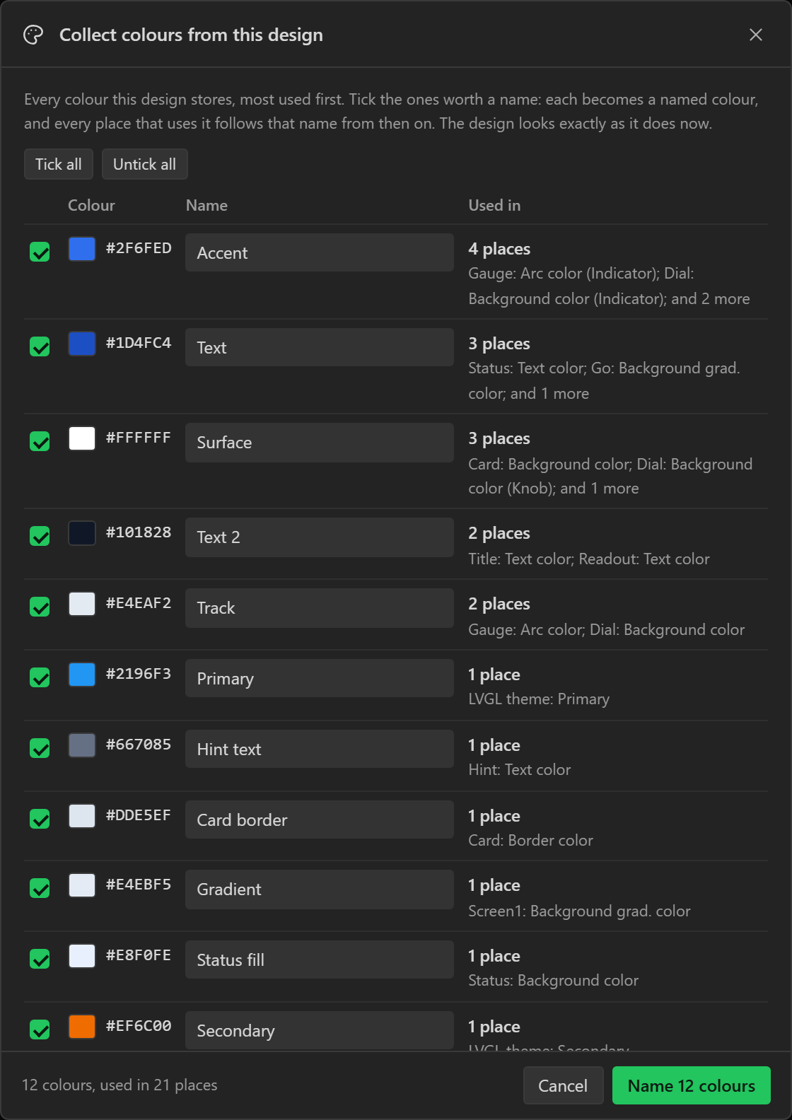
Tick the colours worth a name and confirm. Each ticked colour becomes a named colour, and every place that used it now points at the name. The design looks the same as before, and the export is the same to the byte. The whole step is one entry in the History tab, so one undo reverses it.
The dialog ticks a colour to begin with when more than one place uses it, or when a screen uses it. Suggested names describe a role, such as Accent, Surface, Track or Text, because a role stays true when a dark theme turns a white surface black. A colour that only one widget uses is named after that widget.
You can also add a named colour by hand with Add a colour, and collect again later. A colour that matches a named colour you already have can join it instead of getting a second name.
Themes
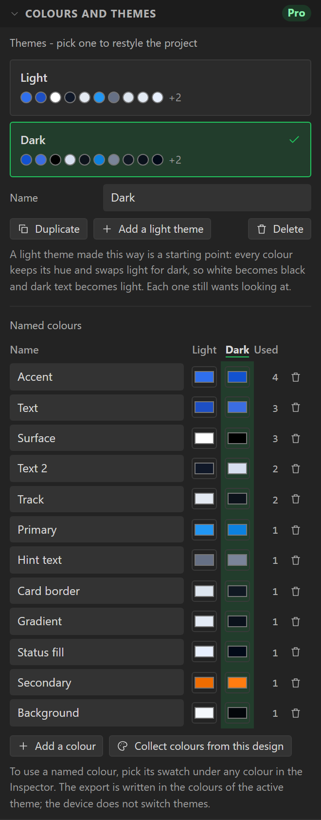
A theme gives every named colour a value. A project starts with one theme, and the table under Named colours has a column of swatches for each theme. Click a swatch to change that colour in that theme.
| Control | Does |
|---|---|
| A theme card | Switches to that theme. The canvas, the preview and the LCD view redraw at once. |
| Name | Renames the theme you are on. |
| Duplicate | Copies the theme you are on, and switches to the copy. |
| Add a dark theme, Add a light theme | Copies the theme you are on with the lightness of every colour turned over. |
| Delete | Removes the theme you are on. The last theme cannot be deleted. |
Add a dark theme is a starting point. It keeps each colour's hue and swaps light for dark, so white becomes black and dark text becomes light. Check each colour afterwards. One colour that does two jobs, such as white for a card and for a button's caption, is one name until you give the caption a name of its own.
Two things stay the same in every theme. A plain colour does, and the section says how many are left in the design. A picture does too, so text drawn over a backdrop image has to read on that image in every theme.
Widgets you have not styled draw in LVGL's own theme, and its Mode is one setting for the whole project. Set Mode to match the theme you export.
Use a named colour on a widget
Once a project has named colours, every colour control in the Inspector shows them as a row of swatches under the hex box. Point at a swatch to read its name. Click one and the widget stores the name instead of a value.
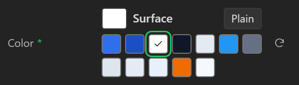
Plain stops the widget following the name and keeps the colour it shows now. The reset control beside it still removes the property, as it does for any style.
Deleting a named colour
The bin beside a named colour deletes it. Every widget that used it keeps the colour it was showing in the theme you are on, as a plain colour, so the design does not change. The Used column shows how many places that is.
What the export contains
The export writes the theme you are on. The server replaces every name with that theme's colour before it generates anything, so the Arduino, MicroPython and ESPHome exports contain ordinary colours and nothing about themes. A design drawn with named colours generates the same files as the same design drawn with hex values.
The device does not switch themes. To ship two looks, switch theme and export again. A gallery entry shows the theme the design was on when you published it, and a copy of it keeps every theme.
A colour that is not in the project
A widget pasted from another project can point at a named colour this project does not have. The canvas and the export draw it in magenta, the Inspector says Not in this project, and the Problems tab lists the widget. Pick a colour for it to clear the warning.
Limits
A project holds up to 200 named colours and 24 themes. A theme holds colours only. Fonts, sizes and pictures are not part of one.