The interface
A tour of the window, panel by panel, and what each control is for.
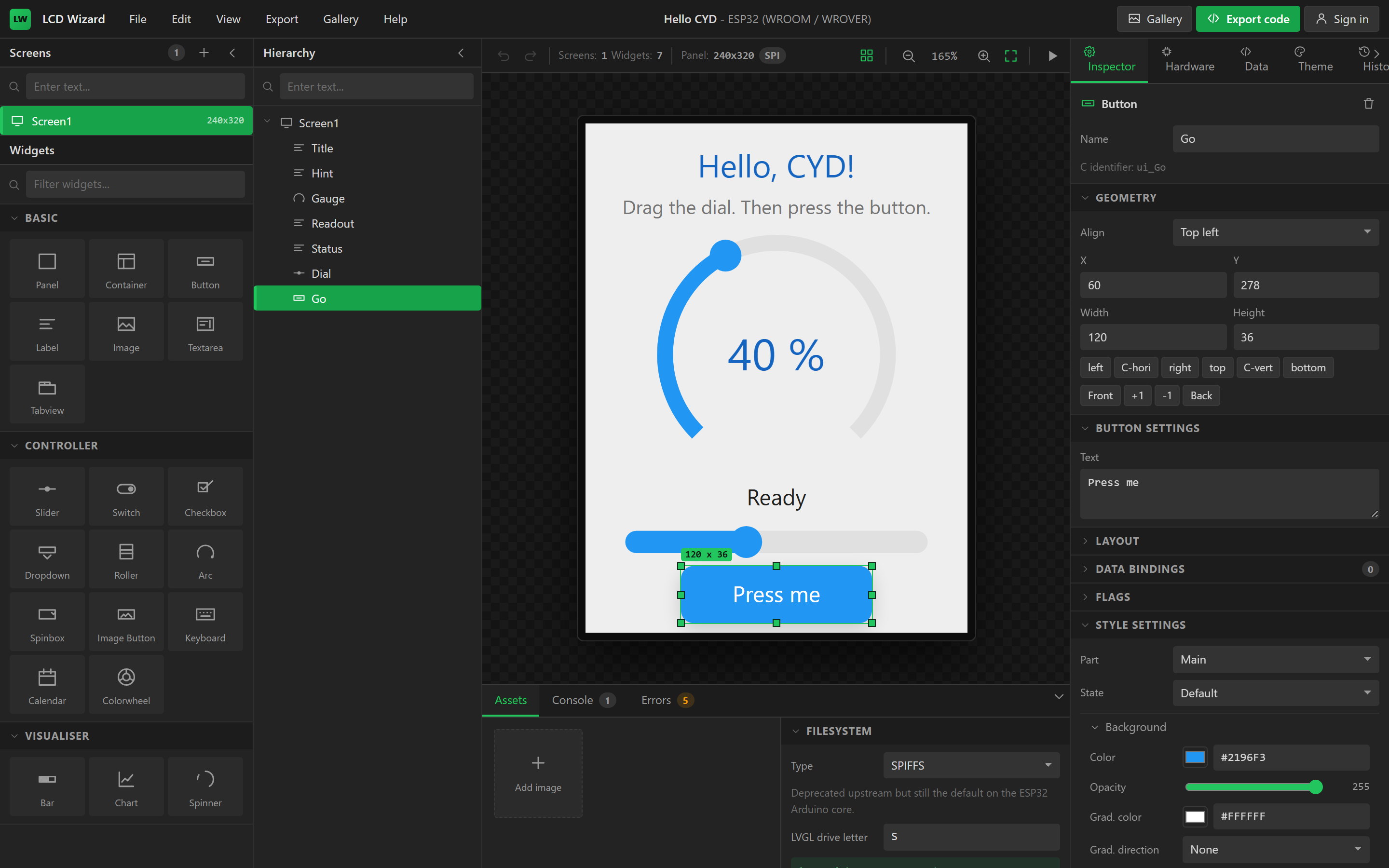
The designer is one window with five regions: a menu bar and toolbar across the top, the Screens, Widgets and Hierarchy panels on the left, the canvas in the middle, the Inspector, Hardware, Data, Theme and History tabs on the right, and the Assets, Console and Errors tabs along the bottom. Which panels are open is remembered per browser, as are the zoom, the grid and which tabs were showing.
The menu bar
| Menu | Items |
|---|---|
| File | New project · My projects (Ctrl+O) · Open project file (.json) · Download project file (.json) (Ctrl+Shift+S) · Save to account (Ctrl+S) · Project settings · Add screen · Import image asset · Publish to gallery |
| Edit | Undo · Redo · Cut · Copy · Paste · Duplicate · Delete · Select all |
| View | Enable/disable grid snapping · Enable/disable alignment guides · Grid 4 / 8 / 16 px · Zoom to fit (Ctrl+0) · Show/hide bottom panel · Show/hide Screens and Widgets · Show/hide Hierarchy · Show/hide Inspector panel · Focus on the canvas / Show every panel |
| Export | Export UI code (Ctrl+E) · Download project .zip |
| Gallery | Browse the gallery · Publish this project |
| Help | Keyboard shortcuts · LVGL documentation · LVGL image converter |
The centre of the bar names the project and its MCU. To the right are a yellow Support button (a coffee for the developer, through Buy Me a Coffee, in a new tab), a Gallery button, the green Export code button, and the account controls: Sign in when you are anonymous, or your nickname with a menu (My projects, Edit profile, Sign out) when you are not.
The toolbar
Undo and redo, a readout of how many screens and widgets the project has and what panel it targets, a snap-to-grid toggle, zoom out, the zoom percentage, zoom in, zoom-to-fit, and the Play button that enters preview. The zoom is a percentage of device pixels, so 100% shows the panel at its native resolution.
Screens
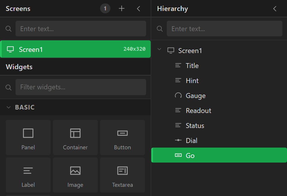
The list of screens in the project, with the current one highlighted. Add screen creates a blank one the size of the panel; the context controls on each entry rename, duplicate and delete it. Deleting the last screen is refused. Clicking a screen makes it current: the canvas shows it and the Inspector, when nothing is selected, edits it.
Widgets
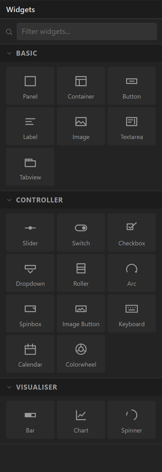
The catalogue, in three groups. Basic is the building material - Panel, Container, Button, Label, Image, Textarea, Tabview. Controller is anything a finger operates - Slider, Switch, Checkbox, Dropdown, Roller, Arc, Spinbox, Image Button, Keyboard, Calendar, Colorwheel. Visualiser shows a value - Bar, Chart, Spinner. Click an entry to add one at the centre of the current screen, or drag it onto the canvas to place it, including into a panel or container. Each is described in the widget reference.
Hierarchy
The tree of widgets on the current screen, in z-order. Click to select, drag to re-parent or re-order, and use the two buttons on each row to hide a widget on the canvas (a designer convenience that is not exported) or lock it against accidental drags. Once a widget holds others, a Collapse all button appears in the header to fold every container.
Folding the panels away
Every side column can be folded to a slim strip, which is the answer on a laptop screen. The chevron in the Screens header folds the Screens and Widgets column; the one in the Hierarchy header folds the hierarchy; the one at the right-hand end of the Inspector / Hardware / Data tab row folds the whole right panel. A folded column shows its name sideways - click the strip to reopen it. The same switches are in the View menu, together with Focus on the canvas, which folds everything (and the bottom panel) in one go, and Show every panel to bring it all back. On a window narrower than about 1240 pixels the hierarchy starts folded; under about 980, so does the Screens and Widgets column.
The canvas
The screen at the chosen zoom, drawn by the same renderer the gallery previews use. Everything you would expect works: click to select, drag to move, drag the eight handles to resize, drag on empty space for a marquee, Shift-click to add to the selection. Widgets snap to the grid (4, 8 or 16 px, from the View menu) and to alignment guides against siblings and the parent's edges and centre; hold Alt while dragging to switch both off, and Shift while resizing to keep the widget square. Arrow keys nudge by one pixel, Shift+arrows by the grid step.
A drag is committed as a single undo step when you release, however far the mouse travelled.
Inspector
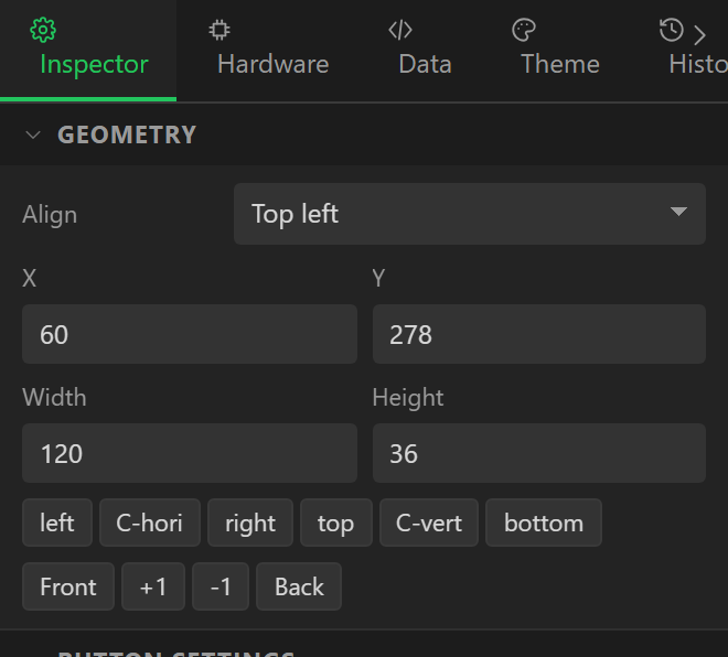
Everything about the selected widget, top to bottom:
- Name - the C identifier, and a Delete button.
- Geometry - Align, X, Y, Width, Height; then a row of alignment tools and the z-order buttons (Bring to front, Bring forward, Send backward, Send to back).
- The widget's own settings - the parameters for its type: a slider's range and value, a label's text and long mode, a chart's series.
- Flags - the
LV_OBJ_FLAG_*switches: Hidden, Clickable, Scrollable and the rest. - Layout - None, Flex or Grid for widgets that contain others.
- Style settings - a Part and a State selector, then every style property grouped by Background, Border, Outline, Shadow, Text, Image, Line, Arc, Padding, Transform and Misc.
- Events - triggers and their actions.
- Data bindings - variables driving properties, and vice versa.
With nothing selected the Inspector edits the screen: its name and the C identifier it becomes, the Temporary and Don't export flags, the Screen size (with a button to match every screen to the display), its layout, its styles and its screen-level events.
Hardware
Eight tabs: Board (preset, MCU, PSRAM, FQBN), Display (controller, bus, pins, resolution, rotation, colour depth and order, inversion, backlight), Touch (controller, bus, pins, address, axis swap and inversion, resistive calibration), Buses (extra I2C and SPI buses), Devices (peripherals and their configuration), I/O (I/O extenders, analog inputs, digital I/O), Inputs (rotary encoder, button pad, keypad) and Check, which carries a badge with the current error count. The three hardware pages - Boards and displays, Peripherals and I/O - go through them.
Data
Two lists: Variables, each with its type, source, formula, unit, decimals and range, and Automations, each with a trigger and an action list. Variables and bindings and Automations.
Theme
The project-wide look: Mode light or dark, the Primary and Secondary
colours and the Default font size, which become the lv_theme_default_init()
call; the LVGL version the project targets (9.x or 8.3.x - it changes which registration
calls and API names are generated); and Fonts in use, the Montserrat sizes the design
currently uses and that will be enabled in lv_conf.h.
History
The undo stack as a list, one entry per committed change, with the label the action gave it - Add Button, Set text, Align. Click an entry to jump back to that point.
The bottom panel
Assets lists imported images and the filesystem settings. Console is where the preview logs things it cannot simulate and where actions report what they did. Errors is the validator's output, the same list the Check tab and the export dialog use. The panel can be hidden from the View menu; each tab shows a count when it has something to say.
Keyboard shortcuts
| Keys | Does |
|---|---|
| Ctrl+Z / Ctrl+Y | Undo / redo |
| Ctrl+C / X / V | Copy / cut / paste |
| Ctrl+D | Duplicate |
| Ctrl+A | Select every widget on the screen |
| Delete | Delete the selection |
| Arrow keys | Nudge 1 px |
| Shift+arrows | Nudge by the grid step |
| Ctrl+S | Save to your account |
| Ctrl+Shift+S | Download the project as JSON |
| Ctrl+O | My projects |
| Ctrl+E | Export code |
| Ctrl+0 | Zoom to fit |
| Escape | Deselect |
Hold Alt while dragging to bypass snapping; hold Shift while resizing to keep a widget square.