Reusable components
Design a card, a row or a key once, use it on any screen, and change every copy by changing the original.
Most designs repeat themselves. A dashboard has four room cards, a keypad has twelve keys, and the same status row sits on every screen. Copied by hand, each change has to be made on every copy. A component removes that work. You design the group of widgets once, as the master, and place as many instances of it as you need. When you change the master, its instances change with it.
Creating a component is part of Pro. Using one is not. A design that already has components opens, edits, exports and clones on every plan, and without an account. You can add more instances of a component the design has, edit its master, and reset or detach an instance. Only making a new component asks for Pro.
Create a component
Select a widget, usually a panel with its contents, and choose Edit > Create component. The same button is at the top of the Inspector. Give the component a name, and two things happen.
- What you selected becomes the first instance. It stays where it is, and its events and bindings keep working.
- A copy of it becomes the master, on a screen called Components that the designer adds to the project.
The designer renames the first instance after the component. A panel called
Panel1 that becomes the component Card is now Card1, and the
label Title inside it is Card1_Title. If your own code uses the old C
identifiers, change it to the new ones.
You can also select several widgets. The designer puts them in one panel exactly as big as the group, and that panel becomes the instance. The panel has no background, border or padding, so nothing on the screen moves or changes colour. The widgets must share a container.
Add instances
The widget palette has a Components group that lists every component in the project, each with a small picture and its number of instances. Drag one onto the canvas, or press it to add an instance to the middle of the screen. A new instance is the size of its master.
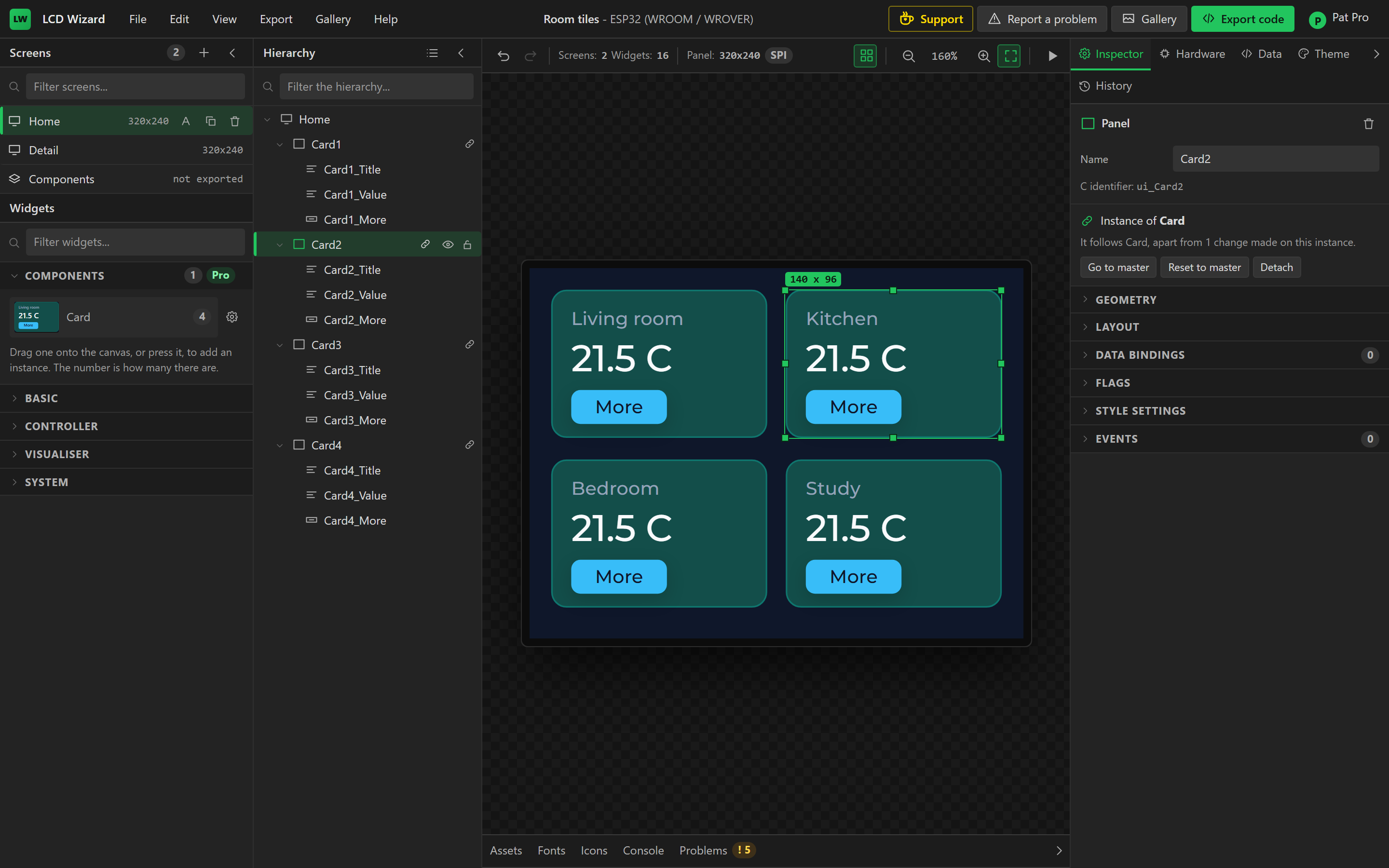
An instance is named after its component, and each widget inside it after the instance and
the master's name for that widget. Card2 holds Card2_Title and
Card2_Value, which export as ui_Card2_Title and
ui_Card2_Value, so your own code can address every instance. Rename an instance and
the widgets inside it are renamed with it.
The Hierarchy marks the top widget of each instance with a link icon. Copying, pasting or duplicating an instance gives another instance.
Change the master
Select an instance and press Go to master, or pick Components in the Screens list. Edit the master with the canvas and the Inspector as you would any widget. Every instance follows in the same step, so one Ctrl+Z takes back the change to the master and to all of its instances.
| On the master | What the instances do |
|---|---|
| A widget setting: text, value, range, image | Take the new setting. |
| A style, on any part and in any state | Take that property. Resetting a property to the theme resets it on the instances too. |
| The size of the component, and the position and size of a widget inside it | Follow. |
| Flags and layout | Follow. |
| An event or a binding added, edited or removed | Follow, pointed at their own widgets. |
| A widget added, removed, reordered or moved into another container | Gain it, lose it, or rearrange to match. |
| A widget renamed | Rename their copy, unless you had renamed it yourself. |
Two things never follow, because they are what make an instance its own. One is where the instance sits on its screen. The other is what the instance is called.
Change one instance
Anything you change on an instance stays as you changed it. Give one card the title Kitchen, and it keeps that title when you change the master's title later. Everything else on that card still follows.
The rule is the same for every property. When the master changes, each instance compares its own value with the value the master had before. If the two were equal, the instance was following, and it takes the new value. If they differed, you had changed that instance, and the designer leaves it alone. A style is compared property by property, so an instance with its own background colour still takes a new border from the master.
| On one instance, you | When the master changes later |
|---|---|
| Changed a setting or a style | The instance keeps yours. The rest of that widget follows. |
| Deleted a widget | It stays deleted. |
| Added a widget | It stays. |
| Reordered the widgets | The instance keeps its order. A widget added to the master goes after the widget it follows there. |
The Inspector says how far an instance is from its master, for example apart from 2 changes made on this instance. For a widget inside an instance it says whether that widget is as the master has it.
Events and bindings
Events and data bindings on the master's widgets belong to the component. In each instance
they point at that instance's own widgets. If a button in the master hides the master's title,
the same button in Card3 hides the title of Card3.
Each event and each binding follows field by field. Set the trigger and the fade on the master, then give each instance its own screen to open or its own variable to show. Later changes to the master's event still reach every instance, and each instance keeps its own target.
Reset and detach
Reset to master, on an instance, undoes every change made on it. It brings back the widgets you deleted and removes the widgets you added. The instance keeps its name and its place. Reset this widget, on a widget inside an instance, puts back that one widget.
Detach turns an instance into ordinary widgets. They look the same and stop following the master.
The Components screen
The masters are on one screen. The designer adds it the first time you create a component and lists it last under Screens. Over each master the canvas shows the component's name and its number of instances.
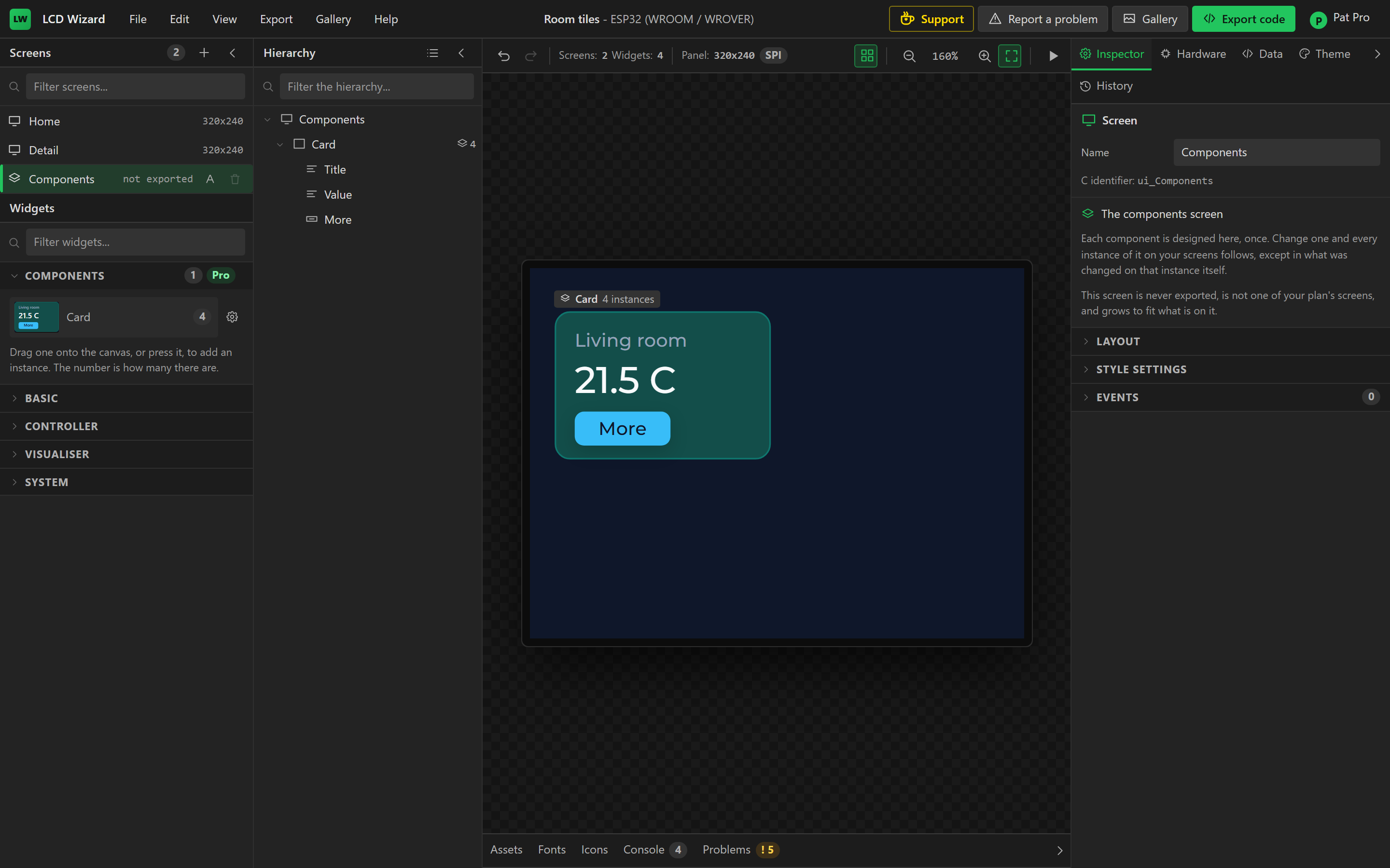
This screen differs from the others in five ways.
- No export contains it, preview does not show it, and a gallery card does not draw it.
- It does not count towards the screens your plan allows.
- It grows to fit the masters on it, so it can be larger than the panel.
- Change Screen and the other screen actions do not offer it.
- You cannot delete it while it holds a component.
A new Components screen takes the style of the screen its first component came from, so a card drawn for a dark screen is edited on a dark one. You can change that style under Style settings.
You can also draw a widget straight onto the Components screen and press Create component there. It becomes a master where it stands, with no instances yet.
To delete a component, select its master and press Delete component in the Inspector, or press Delete. If the component has instances, the designer asks first. The instances stay on their screens as ordinary widgets.
One component inside another
A master can hold instances of other components. Drag a Reading into the master of Card and every card gains a reading. Change the master of Reading and every card follows. A component cannot contain itself, directly or through another component, and the designer refuses that drop and says why.
What is exported
An instance is ordinary widgets in the design, so each export writes every instance as its own LVGL objects with its own names. The Arduino, MicroPython and ESPHome exports produce the same files for a design built from components as for the same widgets drawn by hand. The masters are left out.
A component saves work in the designer and saves nothing on the board. Ten cards are ten sets of objects in flash and RAM, exactly as if you had drawn each one.
Limits
- A component belongs to one project. Cloning a design from the gallery brings its components with it. Pasting an instance into a project that does not have the component gives ordinary widgets.
- The designer counts the changes made on an instance and does not list them. Reset to master undoes all of them, and Reset this widget undoes one widget's.
- A master cannot move its instances, because an instance's place is always its own.
- The canvas does not lay out a grid, so a component built on a grid container shows its widgets at their own offsets, as any grid container does.