Styles
Parts, states, the property groups, and the rule that keeps the exported C clean.
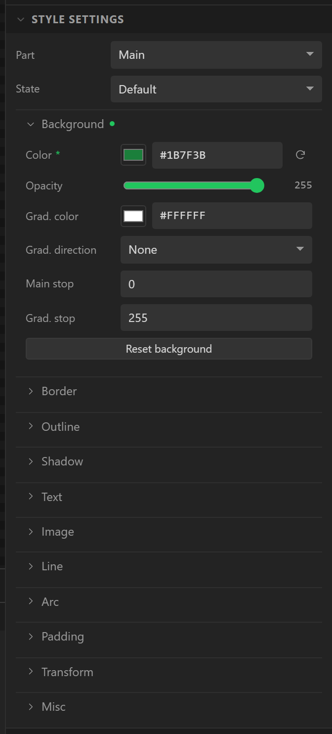
LVGL styles an object by part and by state. The designer follows that exactly: the Style settings section of the Inspector has a Part selector, a State selector, and beneath them every style property grouped the way LVGL's documentation groups them. Set a property and it is stored against the part and state you had selected.
Parts
Which parts exist depends on the widget. Every widget has Main. A slider adds Indicator and Knob; a dropdown adds the list's own three; a chart has Items (the series), Indicator (the points), Ticks and a Scrollbar. The widget reference lists each one's parts. The canvas renders the parts it can - a knob colour, an indicator colour, a chart's ticks - and approximates the rest.
States
Six: Default, Pressed, Checked, Focused, Edited and Disabled. A property set in a non-default state overrides the default one while the object is in that state, which is how a button darkens when pressed or a switch turns green when on. The canvas draws the selected widget in whichever state the State selector is on, so a pressed look can be styled without holding anything down; the preview shows Pressed and Checked as you operate things.
Property groups
| Group | Properties |
|---|---|
| Background | Color, Opacity, Gradient color, Gradient direction, Main stop, Gradient stop |
| Border | Color, Opacity, Width, Side |
| Outline | Color, Opacity, Width, Pad |
| Shadow | Color, Opacity, Width, X offset, Y offset, Spread |
| Text | Color, Opacity, Font, Align, Letter space, Line space, Decoration |
| Image | Recolor, Recolor opacity, Opacity |
| Line | Color, Opacity, Width, Rounded, Dash width, Dash gap |
| Arc | Color, Opacity, Width, Rounded |
| Padding | Top, Bottom, Left, Right, Row, Column |
| Transform | Rotation, Scale, Pivot X, Pivot Y |
| Misc | Radius, Opacity, Clip corner, Blend mode |
Colours are entered as hex; opacities are 0 to 255; sizes are pixels; the font is one of the built-in Montserrat sizes from 8 to 48. Each group has a heading you can collapse.
Only what you change is stored
This is the one rule to understand. A widget carries no style at all until you set something,
and then it carries only that - keyed by part:state. Everything else is the
LVGL default theme, which the canvas draws its own approximation of. Two consequences:
- The generated C contains one
lv_obj_set_style_*call per property you changed and nothing else. A design with fifty untouched buttons emits fiftylv_button_createcalls and no styling. - What you see on the canvas for an untouched property is the designer's rendering of the theme, not a stored value. On the device the real theme draws it, and minor differences - the exact grey of a border, the anti-aliasing of a corner - are expected.
A property you have set shows a Reset to the theme default control next to it, which removes it from the project rather than writing the default value back.
The theme
The Theme tab on the right holds the theme: Mode light or dark, a
Primary colour, a Secondary colour and a Default font size. These
become the lv_theme_default_init() call in ui_init(). The
Switch Theme action flips light and dark at runtime through a generated
_ui_switch_theme(). The preview cannot re-theme the canvas, so it notes the switch in the Console tab instead.
Fonts
Text uses LVGL's bundled Montserrat at the size you pick. The generator enables exactly the
sizes the design uses in lv_conf.h (LV_FONT_MONTSERRAT_14 1 and so on)
and leaves the rest off, which is a meaningful saving in flash. The Theme tab lists the fonts
in use so you can see what will be compiled in. The canvas draws text with your browser's
fonts and metrics, so it is close but not pixel-identical to the panel.
Screen styles
A screen is styled the same way, and a screen background colour is the most common style of all: select nothing, open Style settings, set Background > Color.